Responsive Redesign
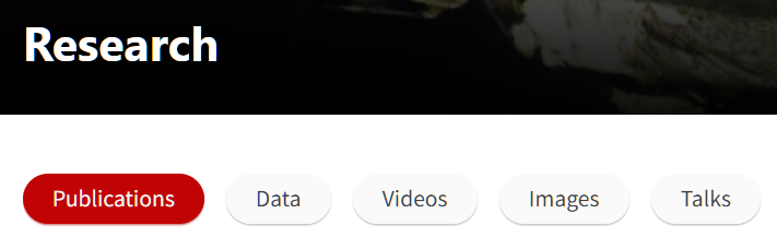
Redesigned page | Original page
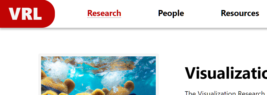
In this project, I analyzed the website of the Brown University Visualization Research Lab (VRL) from the perspectives of usability, learnability, memorability, and accessibility. I then redesigned two web pages (Home page and Research page) that aim to address the identified issues.
The VRL site was chosen for this project because it's openly accessible and its purposes are clear:
- Introducing the lab to the audience
- Showcasing past results from the lab
- Providing readers with helpful information about the lab
Having those targets in mind allowed me to efficiently identify usability problems and find appropriate ways to improve the webpage.
I. Usability Problems
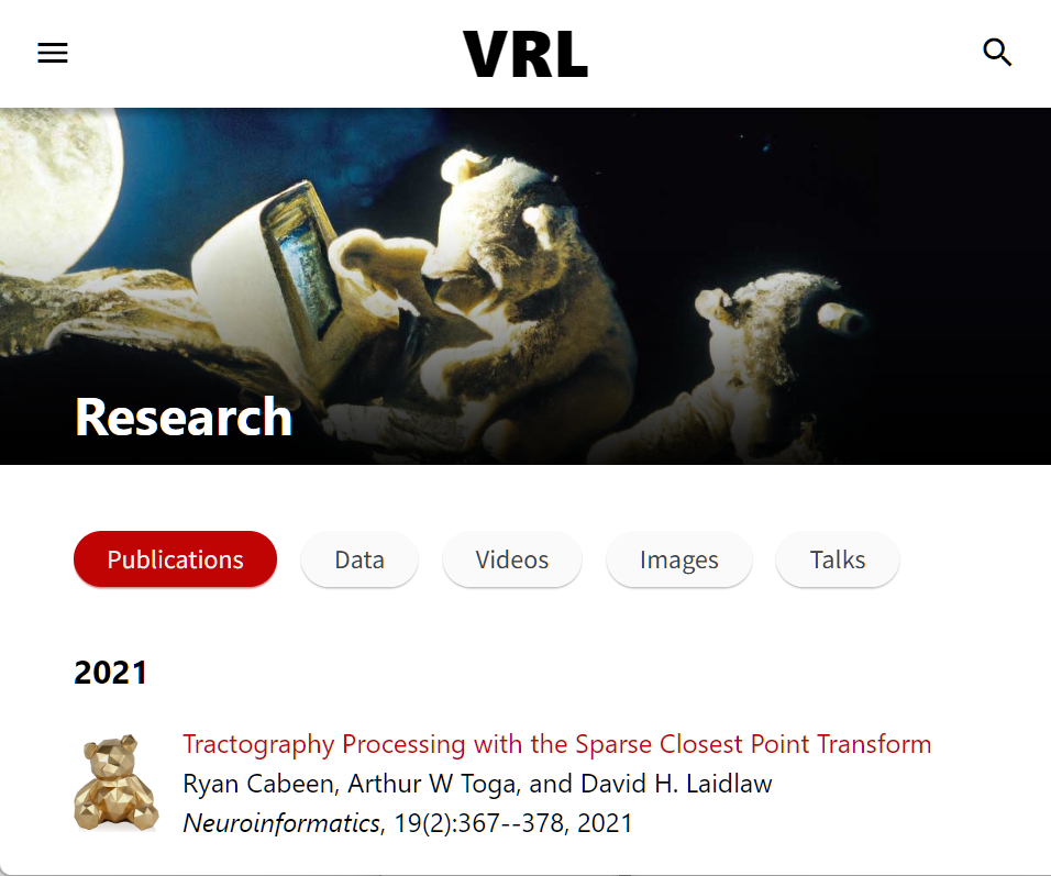
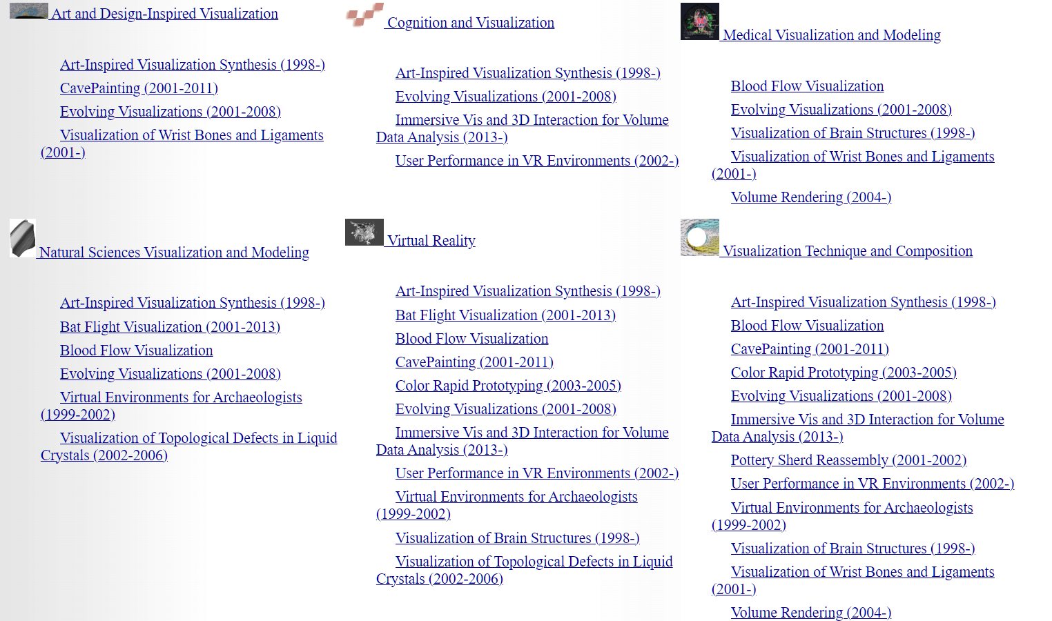
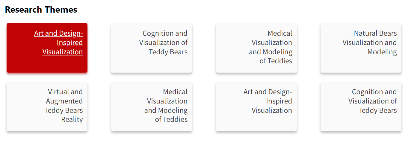
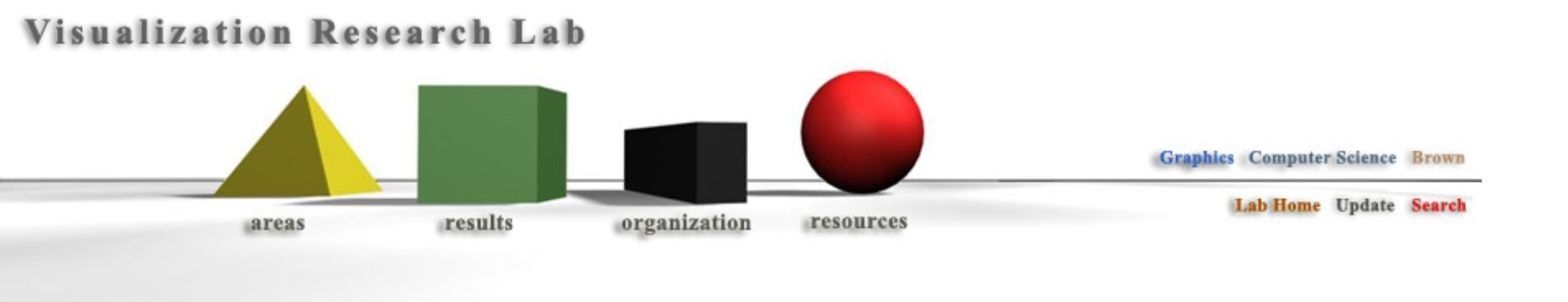
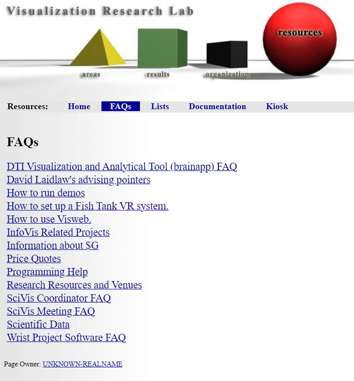
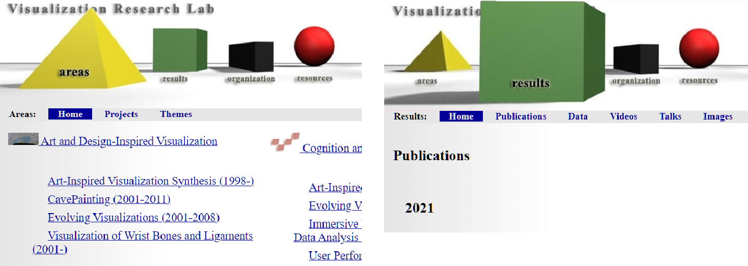
Below I summarized all identified problems of the original web page, grouped by their nature as being most related to usability, learnability, or memorability (click on problem statements or solutions to see screenshots).
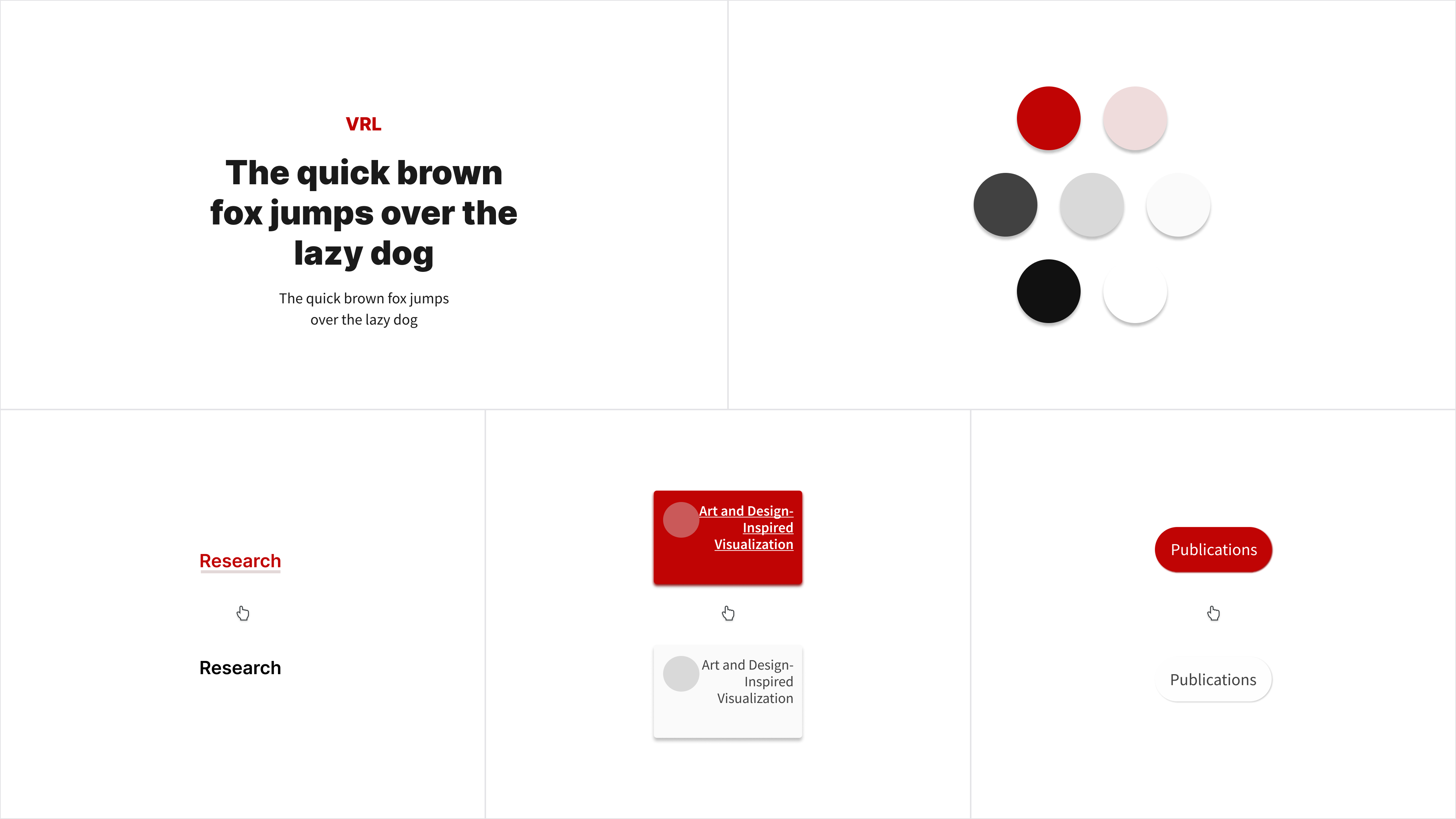
II. Visual Redesign
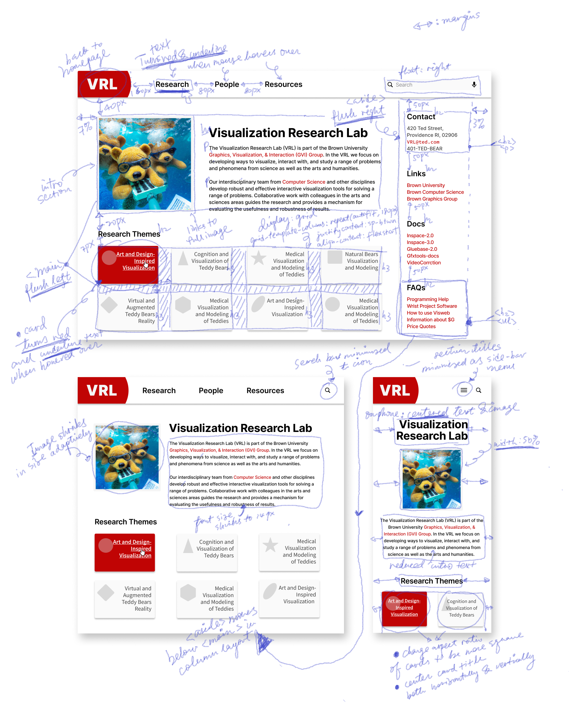
Wireframing
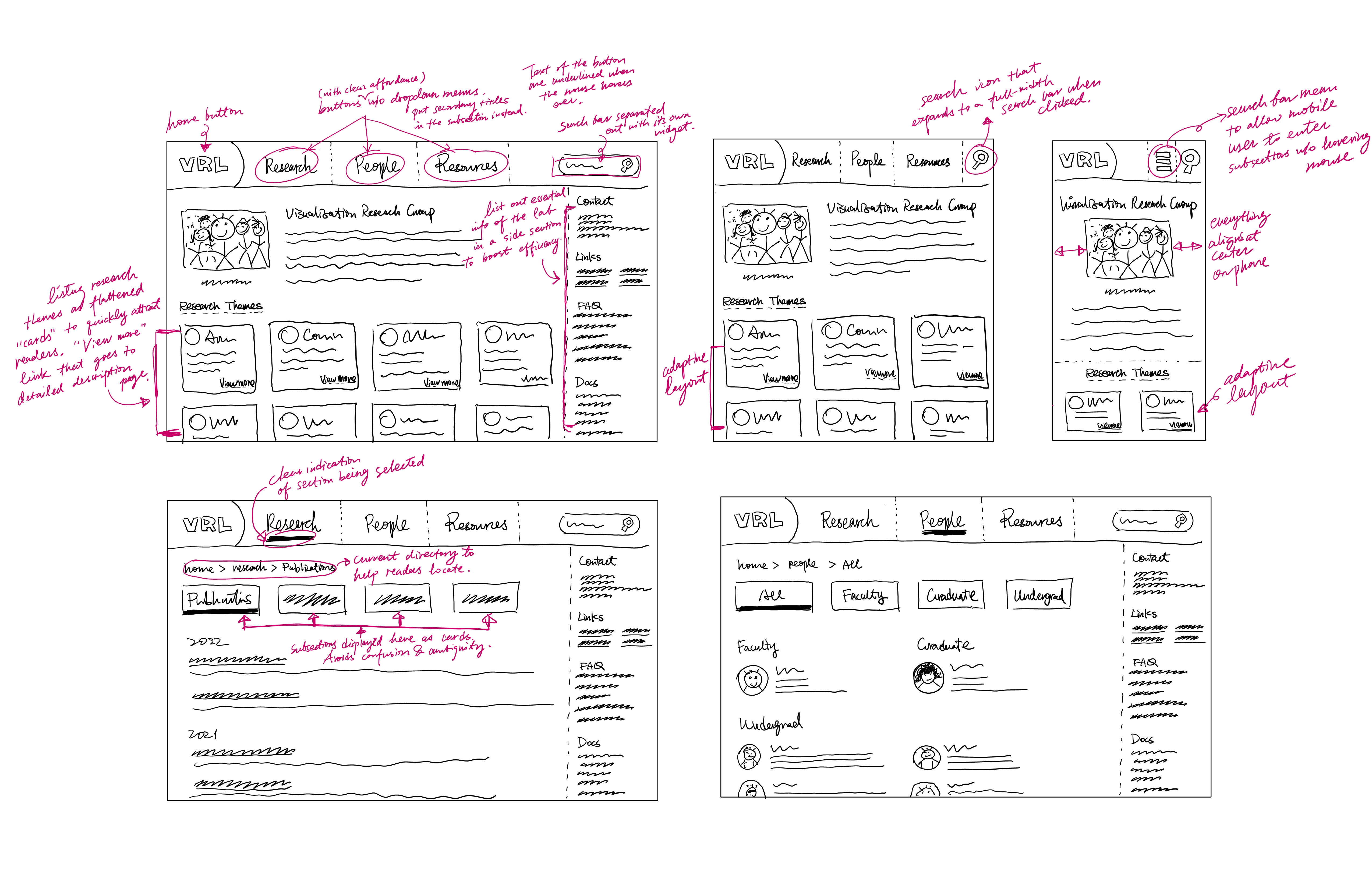
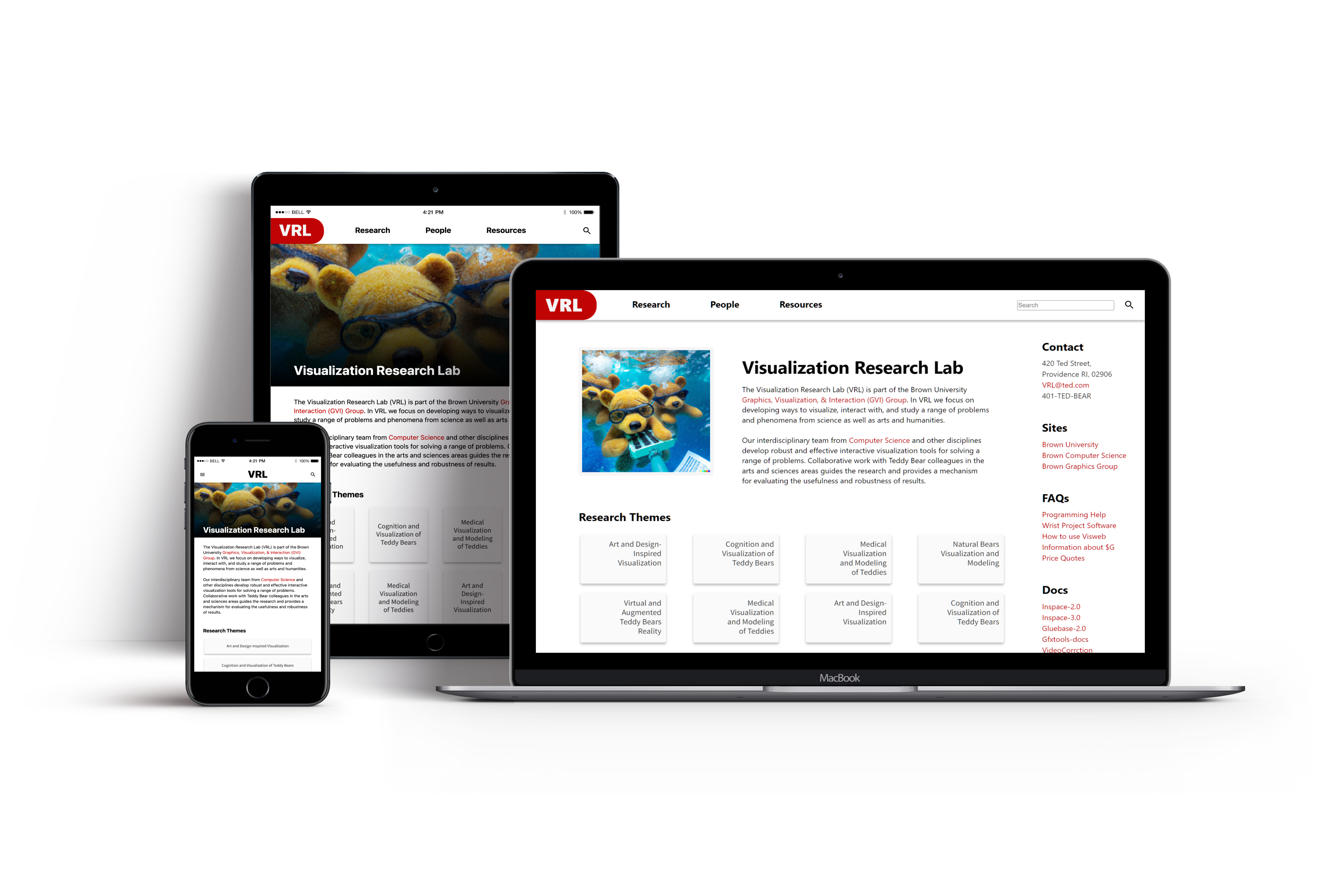
Prototyping