Personas & Storyboarding
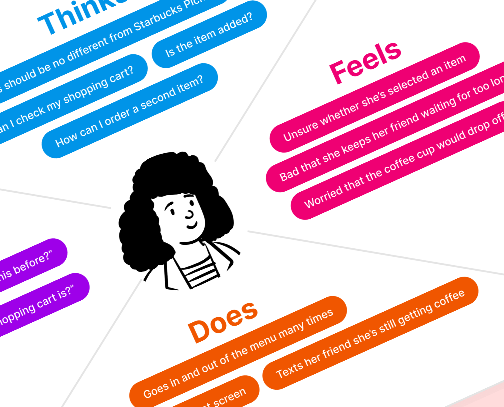
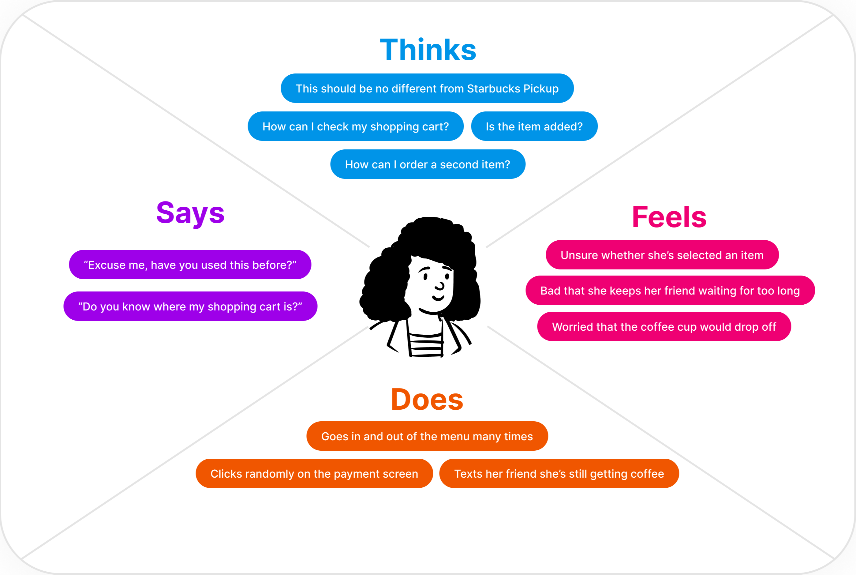
In this project, I observed three users interact with the Coffee Vendor located on the first floor of the Rockefeller Library to gain insights about their general behavior patterns. I also conducted interviews with the users to obtain context and thought processes of individual users. Finally, I created two personas by creating a four-quadrant empathy map to reflect the overarching trends I observed among the users, and storyboarded one persona's entire user journey with the vending machine.
I. Interface
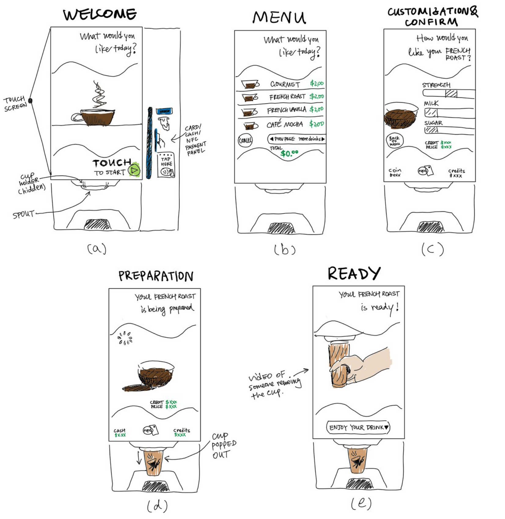
The main interface of the Coffee Vendor is a large touch screen with an ordering software. On the right to the touch screen are slots for card swipe and cash insertion, and an NFC sensor for contactless payment. Other physical components include the cup holder and spout on the bottom of the machine. The ordering software has five main pages: (a) Welcome page, (b) Menu page where users can toggle between pages to select a drink, (c) Customization & Confirm page where users customize their drink and pay to confirm order, (d) Prearation page, during which a cup is popped out and held by the cup holder, (e) Ready page with a video demonstrating how to remove the cup from the holder.
II. User Studies
Observations
- All Users are able to quickly find the entry point (start button) of the interface.
- Most users hesitate about what do to next after customizing their drink on the Customization & Confirm page. Some toggle back and forth between the Menu and the Customization & Confirm page.
- Users seem unprepared when the machine suddenly pops out the cup and holds it in the air.
- Some users try to click on elements of the interface that are not interactive.
Interview
- Most users interviewed are using the coffee vending machine for the first time and aren't familiar with the purchasing process.
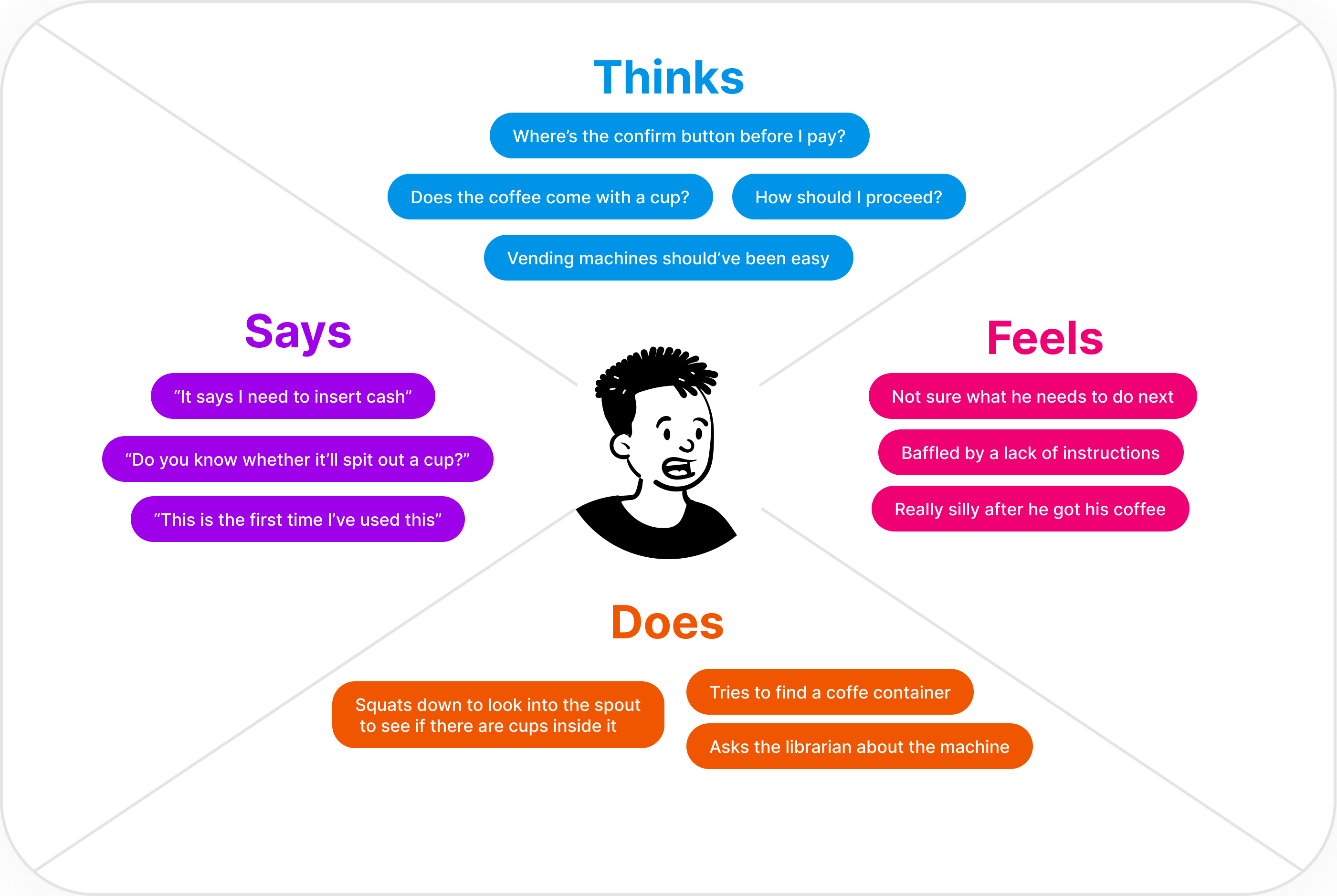
- Most users aren't sure what to expect with the coffee cup, regardless of their past experience. One user who had experience with a similar machine finds it surprising that the machine holds the cup in the air while filling it; another user with no previous experience doesn't know a cup will be provided.
- Some users find the logic of the checkout process to be counterintuitive; They expect a "Confirm" button before paying for the drink rather than the other way around.
- Some users find it cumbersome to order multiple items as separate orders, wishing a shopping cart functionality could be added that allows them to order everything in one go.
- Some users find the graphic illustration on the payment panel to be helpful.
III. Personas
Persona 1. Joy
Joy has lots of friends and is very nice to them. She always likes to buy another cup for her friends when she orders her coffee with Starbucks Pickup. Today she's rushing to meet one of them so she decides to buy two cups of coffee at the Coffee Vendor. Joy represents the user group who have previous experience of ordering coffee through a digital platform but have not used coffee vendors before.
Persona 2. Frank
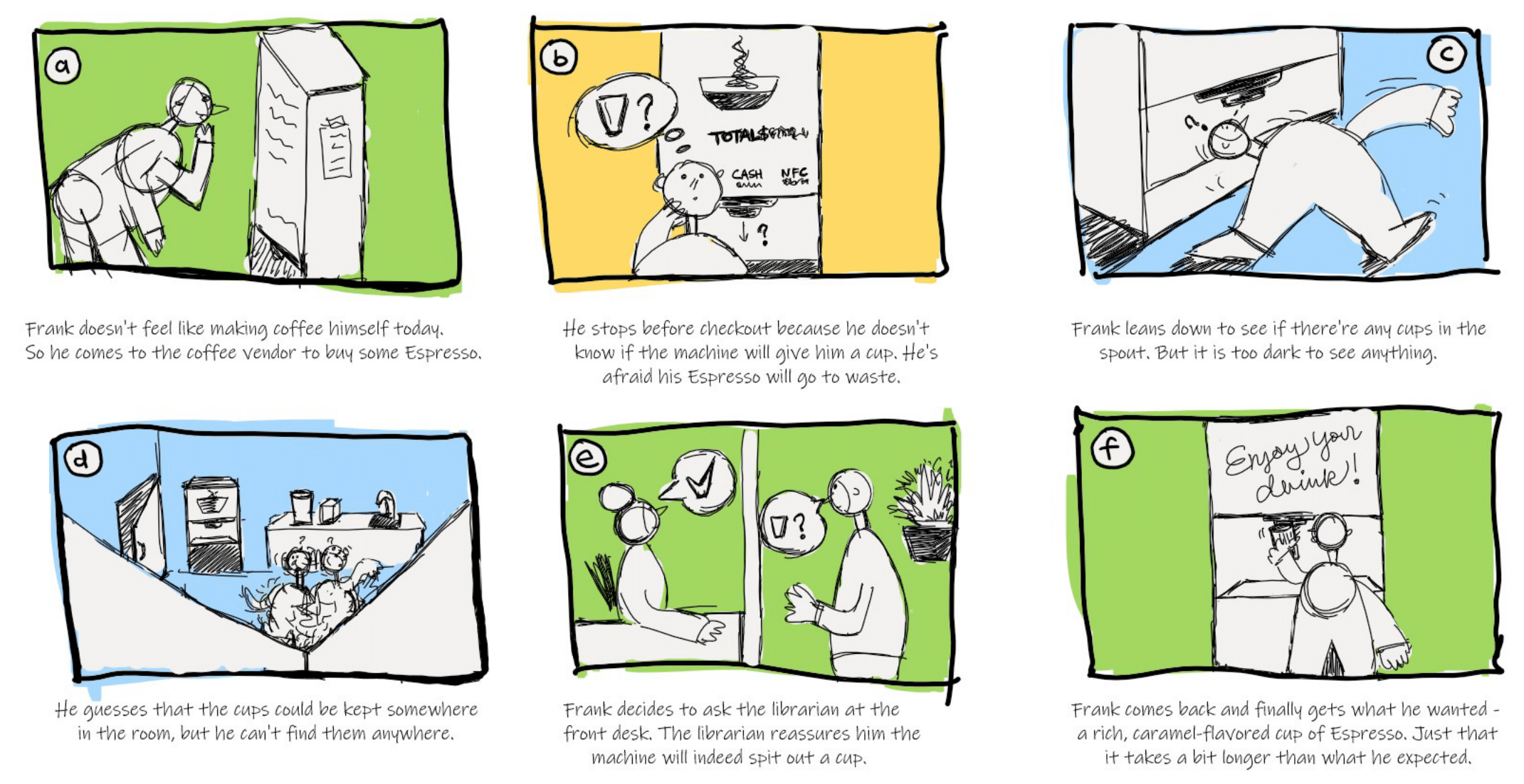
Frank is a coffee lover who makes himself coffee with his coffee machine daily. Today he feels a bit too lazy for that and decides to go to the Coffee Vendor instead. He hasn't used this type of device before but he thinks it won't be that much different from the coffee machine he uses everyday. Frank represents the user group who regularly make coffee themselves and are more used to interacting with a regular coffee machine.
IV. Storyboarding
